
A New Look for Old Newbury
by Bethany Groff Dorau
The poster for this year’s 43rd annual Garden Tour reveals a new element to our evolving identity at the Museum of Old Newbury. In August 2021, the museum contacted Matter Communications, a public relations, social media, and creative services firm, to explore a refresh of the look of our materials. It started off with a simple request – I needed business cards and stationery, and it set off a search for a logo.
The Museum of Old Newbury, like many venerable institutions, has a complicated identity based on a century and a half of evolution. Matter had shepherded Lowell’s Boat Shop, the Custom House Maritime Museum, and other respected colleagues to new and refreshed brand identities, and I was hoping that they would have some ideas for us as well.
My first contact at Matter was an old friend who works in a different branch of the company than the one that could help me with a logo. She sent me to a colleague. The whole thing seemed quite simple – invite some creative people over, show them some cool stuff, and voila…a logo. First, we went on a hunt for past marketing and branded materials. They were legion.

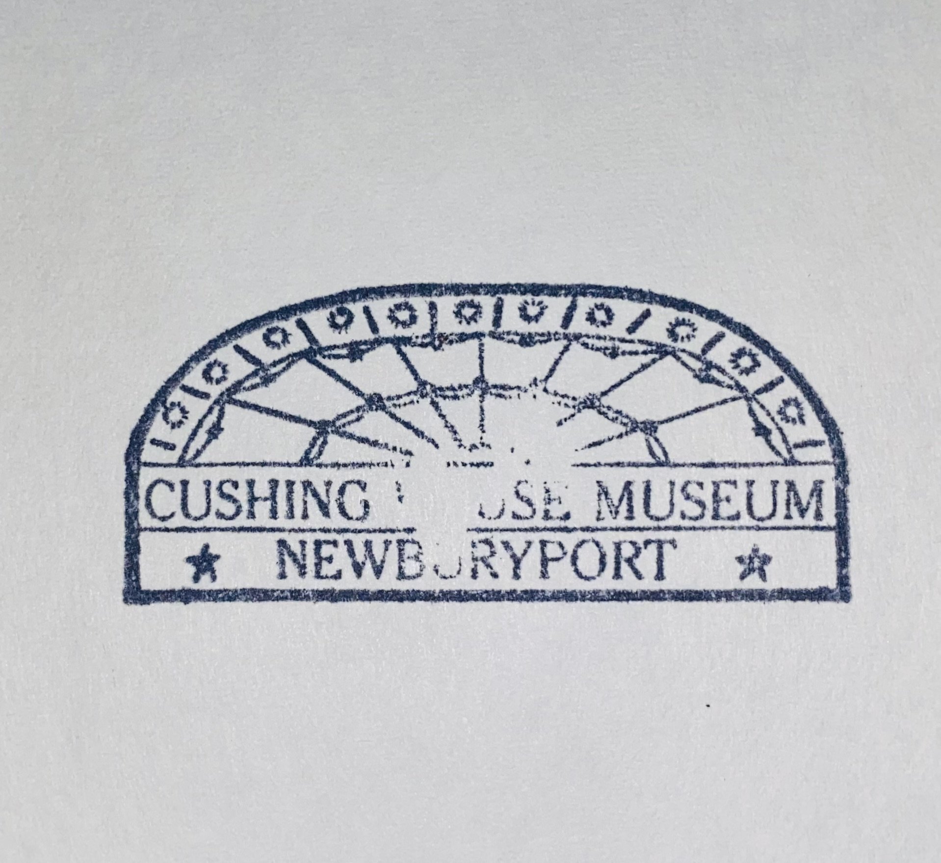
Our legal name is still, and will likely always be, the Historical Society of Old Newbury. Our official letterhead bears that logo – squarely based on their interest in the early years of European settlement. The year of settlement is at the top of the seal, the date of the founding of the Historical Society is at the bottom. There are not one but two people brandishing weapons, a view of a castle, and another of ships in the harbor. It is laden with meaning, with elements that spoke volumes about who the organization was in the first years of its founding, and who they wanted to attract. Aside from some problematic imagery, there was little about this logo, aside from the ships in the harbor, perhaps, that spoke to who the Museum of Old Newbury is today, and who we want to be in the future.
We also had a logo that featured just the Cushing House, others that represented elements of the garden. We had been known as the Hist, 98 High, the Cushing House, The Society, and MOON, among other things. It was a delightful walk-through time celebrating generations in the life of this place I love.
The Matter team came to the museum, and during our conversation, it became clear that this would not be a simple matter of popping some compelling image onto a business card. We needed a deeper dive into who we are.
So, who are we? Our mission statement says what we do, and it is a good place to start, but who are we to our members, our visitors? What do we have that sets us apart? We preserve significant elements of the collection of the Newburyport Marine Society, along with centuries of other maritime history. So, a ship? But wait – the key elements of our collection are just that – the collections. So, a silver spoon? A pewter flagon? A chair? A figurehead? Detail from important local wallpaper? But wait – don’t people really identify us with the wonderful architecture of the 1808 Cushing House? And what about the years, decades, even, of work that has been done on the garden and landscape? Our peach orchard used to be world famous.
This is when you realize why, like so many other professions that look like “fun”, branding and marketing are hard work. Matter took it all in, ran it around in their considerable brains, and gave us some options and some reasons why those options could work for us. In the end, the logo you see represents four elements of who we are. The ship, of course, represents our maritime heritage and collection. The wisteria represents a recognizable element of our landscape (those of you who have ever had to fight with wisteria may wish we had chosen differently). The flagon represents our incredible collection of objects from Colonial Newbury, particularly affiliated with the church, and the Cushing House is our home. Any of these images can be called out and used individually, but as a group, they speak to what we have to offer. And as a group they represent a window, a window not only into our past and the history that built this community, but it also represents a window into what comes next for our growing and evolving community and the role our museum will play. Because after all, a window goes both ways.

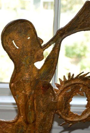
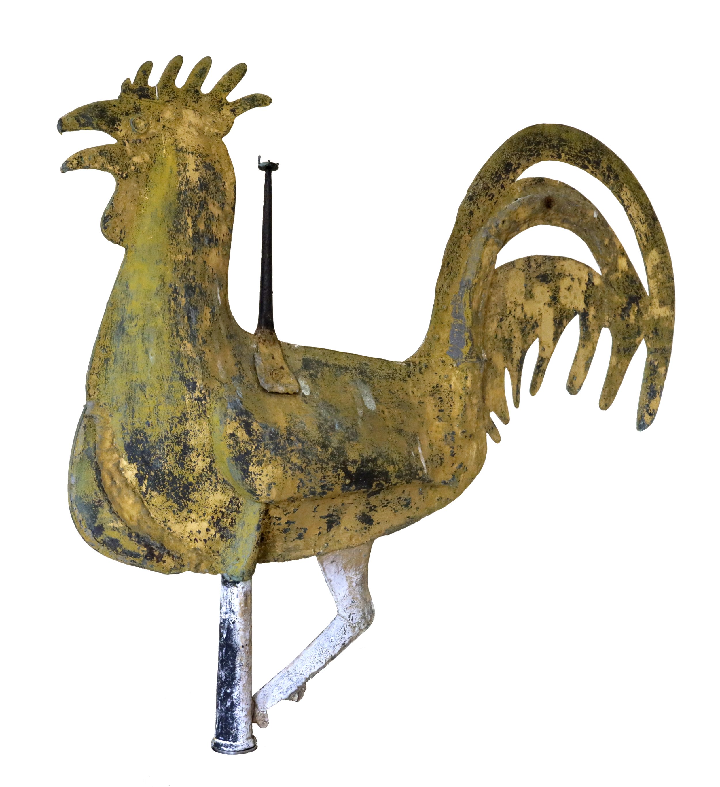
Selection means elimination, and there are numerous elements that we wish we could have included. One logo idea featured the weathervane from the First Religious Society, an iconic rooster. In a logo, however, it did not work as a representation of the museum. The image on the most recent run of business cards, and on the sign outside, was Triton, a remarkable maritime figure discovered during a harbor dredging operation. Known affectionately as the “Merman”, he is an amazing artifact, but rendered in miniature, he is difficult to place. There is nothing that speaks explicitly to our incredible art collection and archive.
The museum will change in the decades, and with any luck, centuries ahead. We will continue to search for the best ways to communicate with our friends old and new. In the meantime, beginning on June 2, you can come see it all for yourself. Buy tickets here.